Well, another deadline is approaching rather rapidly, this time, I will not be rushed nor flustered. Working with Illustrator is somewhat like working in ArcGIS so given that fact I was able to get very familiar with the setup and on the 3rd lab know more ins-and-outs of the software. This time, we were asked to work with typefaces and list the variations and differences in serif versus sans serif. If you are interested here is a link about the variations (something I am fascinated with since labeling in creating maps is rather frustrating). Design Shack
This work can be seen here: type
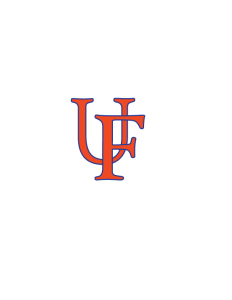
I tried to mimic the “old school” logo of the University of Florida
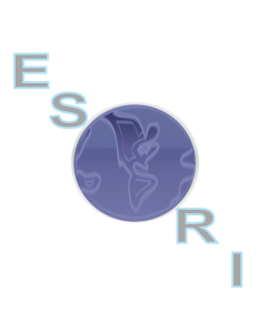
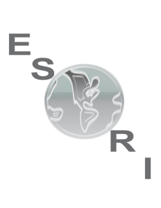
Next, we were tasked with redesigning our own version of a group of well know company logos. I chose Michigan State University (the university for which I am completing this class through) and ESRI (Environmental Systems Research Institute, GIS design software which I use on a daily basis). My attempts are amateurish at best but with more hands-on and time I will conquer this beast. We were asked to create one logo for each company, me in my desire to know all there is to know created and extra set. I choose the “old school” later 50’s through 70’s style. Kind of like the throwback jersey style we see in football. I hope you enjoy, remember my 1st attempt at this so be easy on me.
Make today great, read a book, hug your wife and kids and live like today is your last!
tony
salvo semper
Hebrews 12:1-2